Website Revisions

I generally revise felixwong.com every three to five years to keep up with modern trends in web design and computing technology. I last overhauled the website in 2014, mainly implementing a split magazine layout for articles:
I really like that look, so in this latest revision did not radically depart from that. I did add a menu bar for better discoverability (but perhaps worse aesthetics), much like Microsoft did with Windows 10 apps after moving on from Windows 8.
Another great behind-the-scenes improvement I made in 2014 was adding code to get Bing and Google to index all my articles and images. (At the time of this writing, Google has indexed 1576 articles and 11894 images from this site.) I love being able to immediately and reliably find anything from my site by simply typing in any web browser’s search bar—or verbally asking Cortana or Google Assistant—Felix Wong [search terms].
For example, see Bing’s image search results for all photos I’ve taken for Porsches!
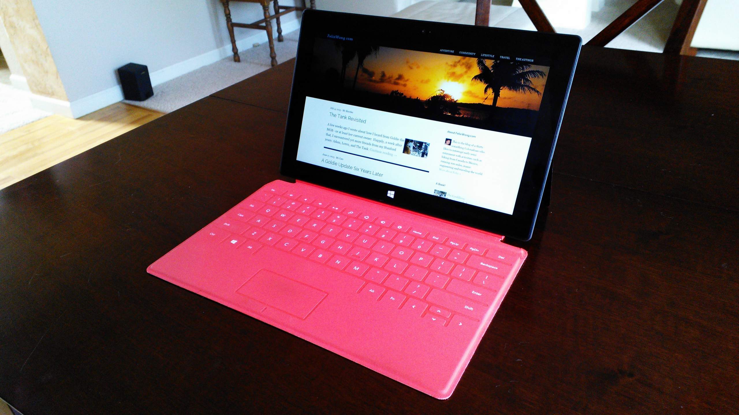
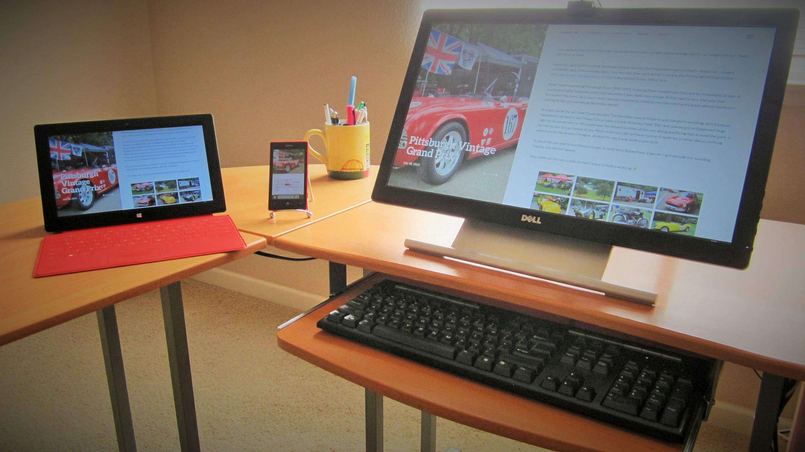
But I did want to improve on how images were displayed on the article pages as they were being shown as cropped 16:9 thumbnails that I would have to click on to expand whenever I was showing photos to people on my phone.
Now (August 2017) the photos at the end of the article are not unnaturally cropped as I figured out a way to display them in a mosaic-like fashion instead of a grid of equal rectangles on large screens, and uncropped/full screen width on smartphones. I think it’s much superior.
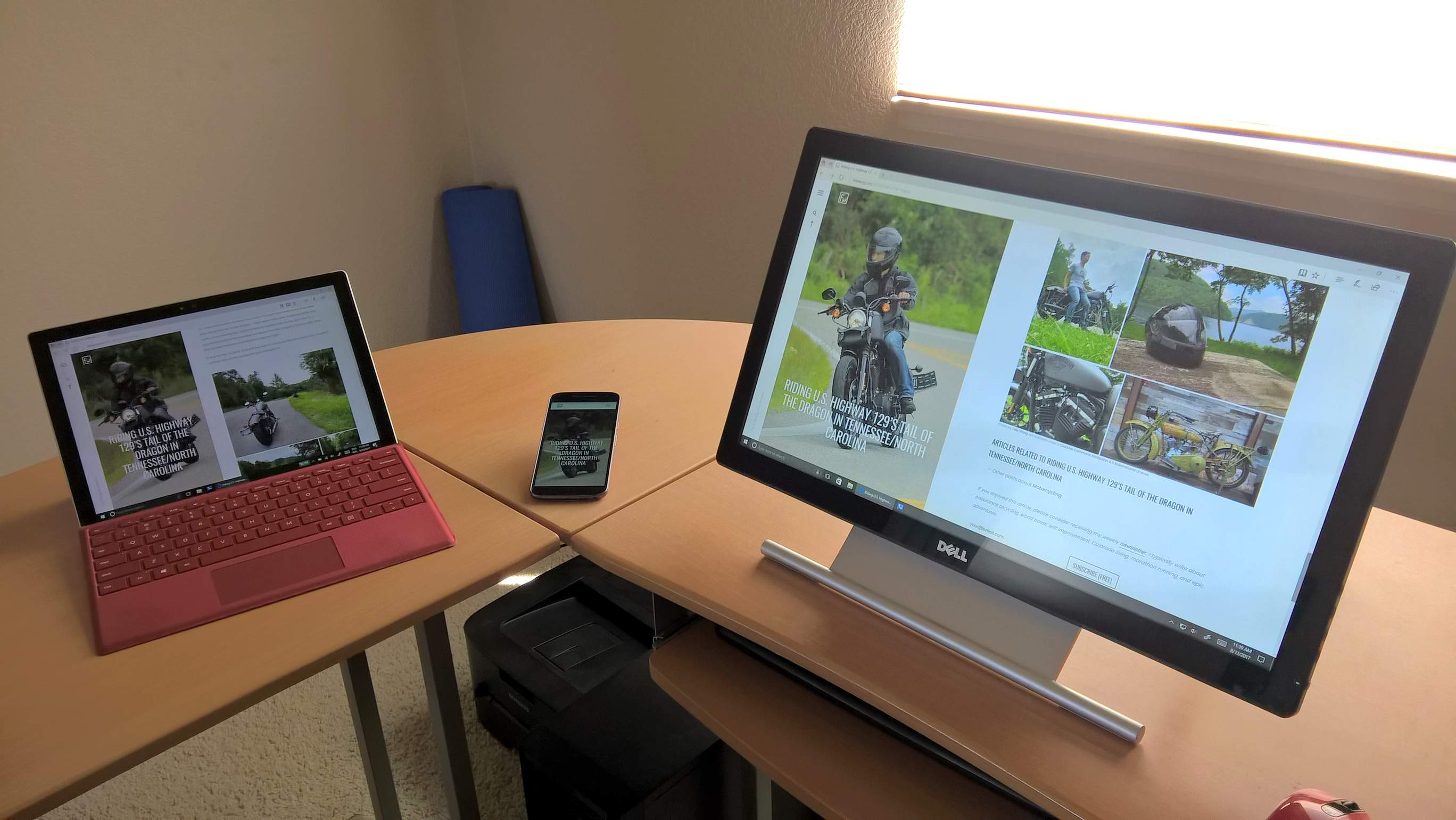
The website also displays embedded content, such as YouTube videos and Strava maps, better. In particular, they now use full screen width on phones.
I also moved comments to underneath the fold, as opposed to auto-hiding them.
Those are the main UI changes. The rest was a ton of back-end stuff, including page loading speed optimization.
Let me know what you think about the (somewhat) new look!
Changelog
July/August 2017
- Photos at the end of the article are not unnaturally cropped anymore in a grid of equal rectangles. Instead, they are scaled and displayed in a mosaic.
- Eliminated redundant photos. Embedded photos within an article now no longer will appear in photo mosaics at the end of an article.
- Embedded YouTube and Vimeo videos now scale well and usually play without any black bars. Also show at full screen width on phones.
- Embedded photos, videos, Strava widgets, and MapMyRide maps display at full screen width on phones.
- Added shortcode functionality so that I can embed images and videos into an article much easier.
- Menu no longer opens to full screen (much like the Windows 8 start menu did). Menu bar functions more like hamburger menus on Android and Windows 10 now.
- Articles’ featured photo now displays full-screen on phones.
- Replaced hero images on the home page.
- Added latest video to home page.
- Blog (on home page and dedicated page) displays the first 30 or so words of the articles underneath article’s featured photo.
- Comments no longer auto-hide; instead they are displayed underneath the page fold in a full-screen-width section.
- Replaced social links and training log text links with scalable vector graphic icons.
- Now use HTML5 tags like nav, section, header, article, and footer to give a better sense of structure to search engines.
- Embedded more structured data with information about posts for search engines. Hopefully this gets Google to recognize the licensing terms for my photos (Bing already did).
- Optimized page speed. Most article pages now have a Pingdom score of 95-100 (out of 100) and load within 300-2000 milliseconds. They usually achieve a Google Pagespeed score of 85-100, with the main issue (if not a score of 100) mainly being a sometimes slower-than-optimum server response time that is not entirely under my control. There’s more optimization work I could do on the home page, but it is the entrance point for only a small percentage of people, so I am leaving it unoptimized for now.
- Changed body font to Poppins.
- The few articles that contain affiliate links now disclose this at the top of the page.
- At some point in the last year, my site got hacked and spam links were sneakily inserted. I only recently discovered them. I managed to eliminate, I believe, 99.9% of them, while significantly enhancing security of the site.
- Reduced number of installed plugins to four trusted ones (including one of my own) for speed and security reasons.
March 2019
- Turned website into a Progressive Web App (PWA). Users can pin website to home screen on phone, and it will launch like an app without browser chrome. Also caches pages for offline mode.
October 18, 2019
- Implemented Dark Mode. Website will automatically load in Dark Mode whenever browser is in Dark Mode. Especially useful on phones with AMOLED displays as it will save battery life.

How the Site Evolved over the last 20 years
I thought it would be neat to see how my website evolved, so below are screenshots and photos of it from the last couple decades. Over that time, both technology and my coding skill have advanced tremendously.
There’s still a lot I can learn as web design is merely one of my gazillion hobbies and is not my primary occupation, which is mechanical engineering. But I do feel like I know enough to create web sites at a professional level if I chose to.
![[1995-1998] "Felix's Fecund Figurations" was mainly about some bicycle century rides and MGBs.](https://felixwong.com/gallery/images/f/fw_website.jpg)
![[1998-2003] Topics expanded to include not only The Open Road, but climbing (which included hiking) and travels.](https://felixwong.com/gallery/images/f/fw_website-1.jpg)
![[2004-2007] The site still contained four main groups for an "earth theme" (Open Road, Climb, Water, World). Early 2005 was notable for going to a blog format and dynamically-generated web pages.](https://felixwong.com/gallery/images/f/fw_website-2.jpg)
![[2008-] Added more general categories, which should be adequate for the next few years at least. Greatly enhanced photo presentation and integration with articles.](https://felixwong.com/gallery/images/f/fw_website-3.jpg)