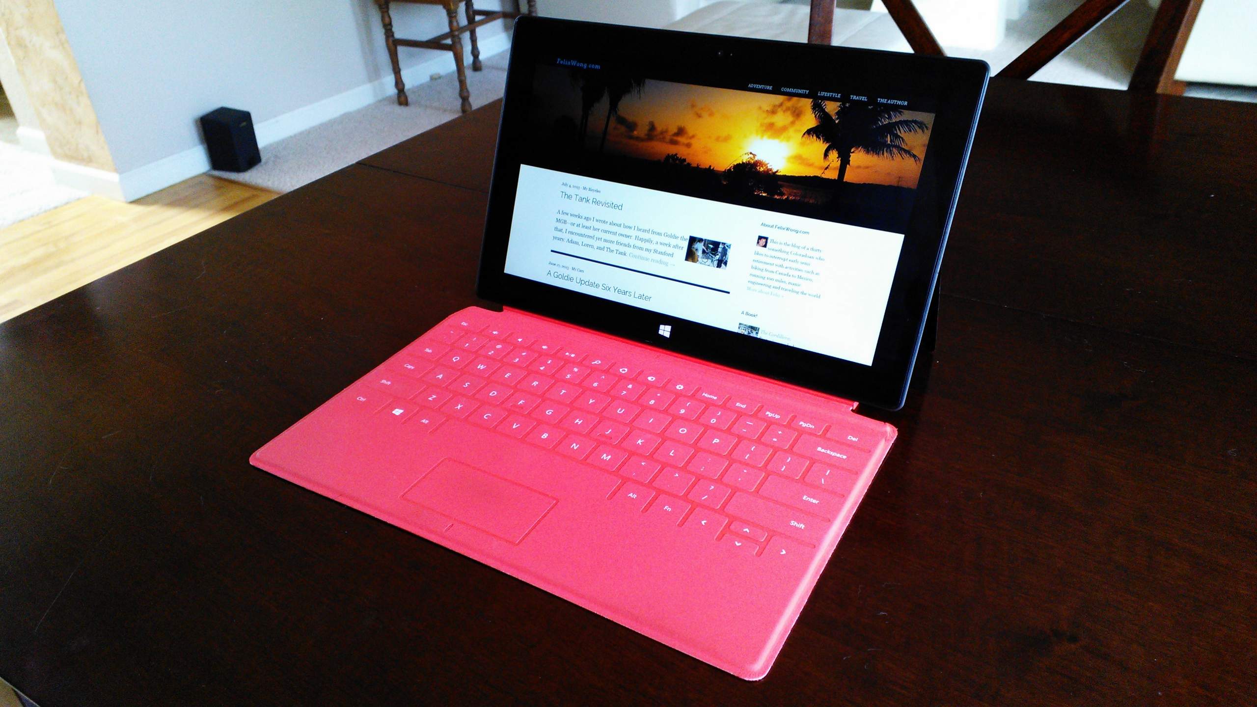
Website Redesign
For the first time since December 2007, I have redesigned this website: namely, to make it much more responsive (mobile-friendly). Check it out and let me know what you think.
Changes include:
- Adapts to the size of your browser or device. It’s much more readable on cell phones now, I think.
- Article featured images now take up the full width of the browser (device). It’s almost like using full-screen without having to press a full-screen button.
- You can quickly access previous and next posts from a post by clicking on thumbnails under the main photo.
- Each article now shows thumbnails for all photos related to that post. (Before I used an algorithm to just show an appropriate number of photos for that post. So now no more clicking of a “show all photos” link is required.) The thumbnails appear after each article now instead of in the sidebar.
Starting earlier this year, I started taking photos in 16:9 widescreen format. This is because my phone, tablet, laptop, and TV use this screen size. Since I view 99% of my photos on one of these devices, I figured I might as well start shooting in that format.
They still should appear ok on the “older” 4:3 standard that, say, iPads cling to.
Speaking of the iPad, I am trying to make my website Retina-friendly by uploading high-resolution photos. From now on I will upload images at 2560 pixels on their long sides. This results in 300 pixels per inch on a 10-inch tablet and is already beyond a human eye’s ability to decipher pixels at roughly 250 ppi. It is also equivalent to many print magazines.
It appears that even at this high resolution (versus many of my site’s photos at 600 x 400, or 72 ppi), I can keep photo size small by doing a lot of JPG compression. E.g., use the “minimum” size image quality setting of Picasa for my photo exports. (This seems to correspond to JPEG quality setting of 65.) Apparently, pixel density is much more important than pixel quality for high-resolution displays.
I will see how this goes for the next couple months, and retroactively upload higher-resolution photos (dating back to the last few years at least) if this goes well. I may also change the code to detect the screen resolution and type of device, and to serve photos of appropriate sizes.
One thing I am missing from my old website theme is listing all articles in a particular category. I like not having that clutter anymore but may add that functionality back in some sort of capacity (e.g., drop-down menu).
[Early September 2013: Retroactively uploaded higher-resolution images of all my existing photos. Unfortunately, it looks like most were shot at under 1000 pixels prior to, say, 2009, so photos prior to then will remain relatively low resolution.]
