Website Overhaul 2020
In late 2020, I created a new WordPress theme from scratch to minimize page loading times for every page and to better surface the more interesting content of the now 1764+ articles.
For the first time ever, my site serves distinct pages for mobile and desktop.
Both Mobile & Desktop
- New sections for Greatest Epics and In the Media
- Lazy-load images
- Show featured photo with related articles
- Some archive pages, when there are not too many posts, will show post featured photo and snippet instead of merely listing titles.
- Make some potentially copyrighted photos private
- On category archive pages, show parent category with thumbnail
- Added avatar to articles and comments
- Eliminated Gravatars in comments to reduce number of server requests
- Changed all GIFs to repeating MP4s that user have to start
- Use SVG sprites instead of font-awesome
- Got rid of hamburger menu and use FW logo to trigger menu instead on hover
- Use inline SVG sprites in Lightbox instead of individual PNG
- Only 1 CSS file
- Minified files
- Use ld+json structured data for image licenses
- Disable right click to make it harder to rip-off site
Mobile
- Pages on mobile download mostly 414px-wide images, except for the featured photo which is roughly 780px.
- YouTube videos are no longer embedded. Instead, clicking on a placeholder opens up the video in the YouTube app.
- No longer use Lightbox on mobile. Instead, clicking on a photo will open the photo in a page that allows rotation and viewing photo meta info.
- Tables use full width of screen with no overflow
- Display captions underneath photos instead of requiring clicking on photo to view caption.
- Horizontal navigation bar for Back, Epics, Media, Blog, Contact, and Next on home page and after articles
- No Javascript
Desktop
- Images maximize use of the screen; there’s very little empty space around them now.
- Photos in posts’ photo gallery are from the 414px Mobile collection
- Only 1 Javascript file
- Rounded corners of images
- Vertical navigation bar for Back, Epics, Media, Blog, Contact, and Next
Refinements
2022-05-02
- Removed border FW touch screen and splash screen icons
- Gave FW button rounded corners
- Made PWA work better with Apple devices (black-transparent status bar style)
- Removed or added rounded corners to various image elements
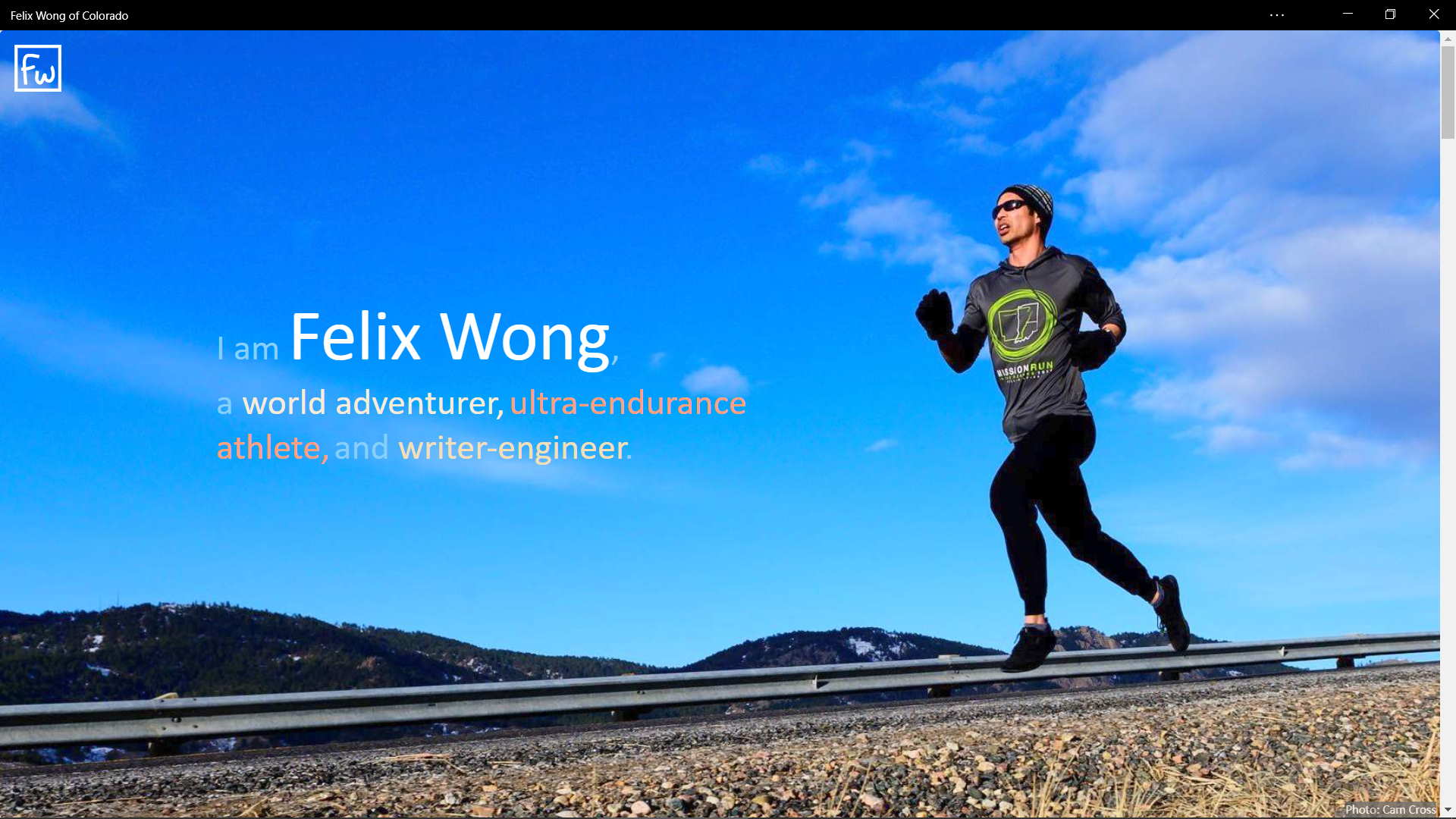
- Made home page image singular for mobile and desktop so it always appears correctly
- Home page taglines now colored and in middle of page for portrait mode, similar to landscape mode
- In landscape mode, made captions for article photos visible (except for photoGallery or articlePhoto)
2022-07-08
- Made it such that a:hover and a:active changed colors of links. It was a small change but very nice to have the visual confirmations.
