An Example of What Not to Submit to Apple’s App Store (Minimal Functionality)
A few months after getting an iPad Pro 12.9 (5th Generation), I started learning Swift–Apple’s newish programming language for iOS. After going through the lessons of Swift Playgrounds, I tried to create a functioning app for the App Store. Notwithstanding Apple’s claims that anyone can learn their new programming language swiftly, it was much more difficult than I anticipated.
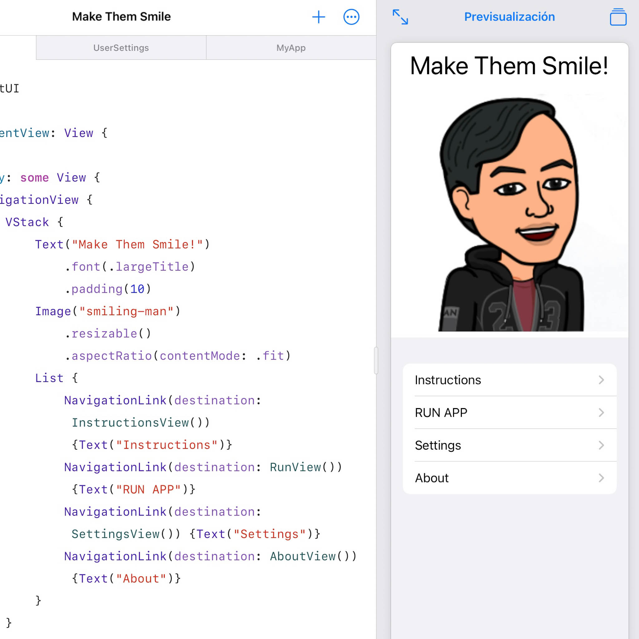
My first app–dubbed Make Them Smile!–is not far removed from, say, a “Hello World!” app. But it taught me how to work with navigation views, do basic formatting, and even store user settings. Plus, I believe it would have lived up to its claim of “making them smile.” At least, when I tested it out on my girlfriend, she grinned!
This was the app:
However, within two days of submission to the App Store, Apple summarily rejected it. Their reason was the following:
Guideline 4.2 – Design – Minimum Functionality
We found that the usefulness of your app is limited by the minimal amount of content or features it includes.
Next Steps
We encourage you to review your app concept and incorporate different content and features that are in compliance with the App Store Review Guidelines.
We understand that there are no hard and fast rules to define useful or entertaining, but Apple and Apple customers expect apps to provide a really great user experience. Apps should provide valuable utility or entertainment, draw people in by offering compelling capabilities or content, or enable people to do something they couldn’t do before or in a way they couldn’t do it before.
Clearly, I should have read Apple’s App Store Review Guidelines beforehand. Long gone are the days when Cupertino’s most famous company would accept fart and other crap apps.
It looks like I will have to go back to the drawing board. Not only will I have to learn a lot more Swift, but also come up with better app ideas!
